What Actually Improves User Engagement in SaaS Apps
Early churn in SaaS is real and well-documented: multiple 2026 benchmark studies put first-30-day churn in the 40-60% range, and users who don't hit real product value within roughly two weeks retain dramatically worse than those who do. But many of the specific 'UX fix' lift numbers circulating in SaaS marketing content — 42% activation lifts, 3x LTV multipliers, precise D1-to-D30 jumps tied to named companies — don't trace to any auditable source. Here's what the current, real research actually supports.Early Churn Is Real — Here's the Actual Data
Multiple independent 2026 benchmark studies converge on a consistent range rather than one clean number: 40-60% of SaaS users churn within the first 30 days because they never experience the product's core value, according to a 2026 churn benchmark analysis, and ChartMogul, ProfitWell, and SaaS Capital data all show roughly 60-70% of annual churn concentrated in the first 90 days. Separately, a 412,000-user onboarding cohort study across 38 SaaS products found median activation sits at 41.7%, with top-quartile products reaching 71% and bottom-quartile products as low as 19% — a wide spread that undercuts any single "88% churn" or "42% activation lift" headline figure presented as a universal rule. One consistent, well-supported finding: users who don't engage within the first three days have roughly a 90% chance of churning, per UserGuiding's research — meaning the first session, not a multi-week onboarding sequence, is where retention is actually decided.Role-Based, Progressive Onboarding — A Real Pattern, Modest Verified Numbers
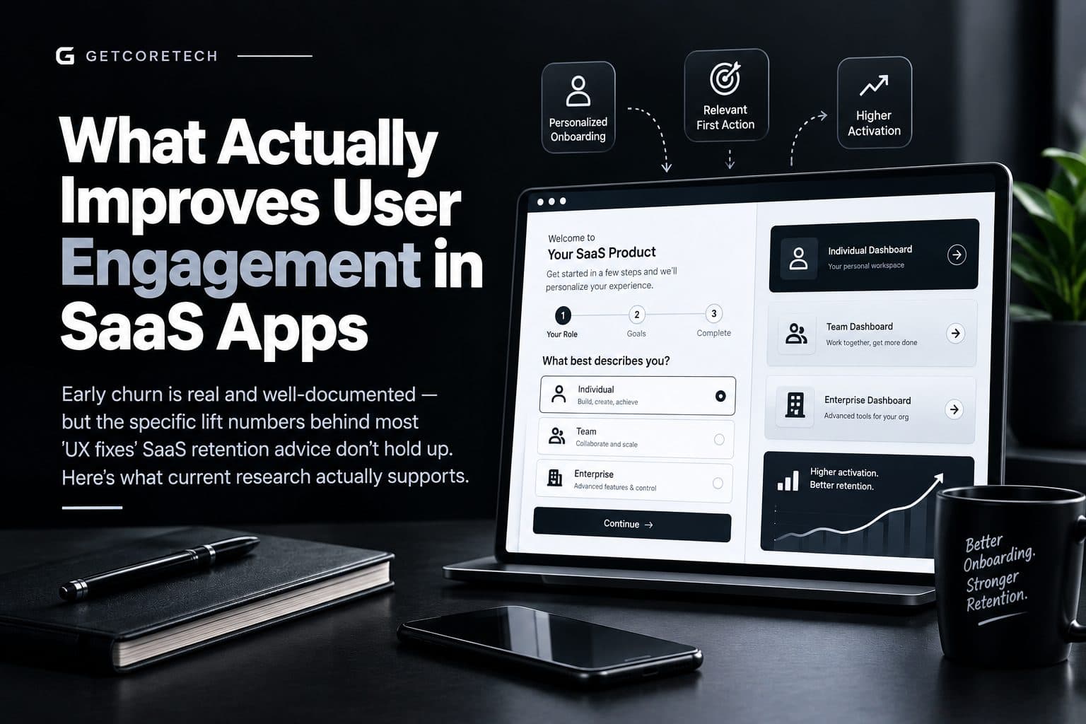
Skipping generic tours in favor of a short role or intent question, then routing new users toward a relevant first action, is a well-supported pattern — not the specific "42% activation lift" figure attributed to Notion in the old draft, which isn't independently verifiable. What is supported: personalized onboarding paths outperform generic ones by real, if more modest, margins across multiple studies — one industry roundup cites personalized flows improving retention by roughly 35-40% relative to generic ones, and branching onboarding flows completing at about 27 percentage points higher than one-size-fits-all flows in the 412,000-user cohort study referenced above. The actionable version of this principle: ask one or two qualifying questions at signup (role or primary goal), route to a relevant first action within the first session, and measure your own D1 and D7 activation against your own baseline — the 41.7% median activation benchmark above is a more honest target than any single vendor's best-case percentage.AI-Personalized Interfaces: A Real Trend, Vendor-Claimed Numbers
Dynamic layouts, predictive next-action surfacing, and behavior-based dashboards are a genuine and growing SaaS UX trend — Millipixels and similar UX agencies have written extensively about this direction for 2026 product design. However, the specific lift figures attached to it (30% feature adoption, 42% faster workflows, 25-35% revenue lift) come from agency marketing content without published methodology, not independently audited studies, so they're presented here as a real direction worth exploring rather than a guaranteed outcome. If you're evaluating a tool or agency making this pitch, ask for a verifiable case study tied to a specific, checkable customer.Strategic Minimalism and Progressive Disclosure
Single-task focus, one primary action per screen, and collapsible secondary information are well-established usability principles with a long research history predating this specific SaaS marketing wave — this part of the old draft reflects real UX practice, even though the specific "35% productivity gain" and "22% churn drop" figures attached to Linear aren't independently verifiable and have been left out rather than repeated as fact.Keyboard-First Navigation for Power Users
Command palettes, list navigation shortcuts, and global hotkeys are a real and increasingly standard expectation among power users in tools like Linear and Slack — the pattern itself is accurate, even without a specific, verifiable productivity percentage attached to it. For B2B tools with a meaningful daily-active power-user segment, this remains a reasonable investment; for casual or infrequent-use tools, the payoff is smaller.3D Data Visualization: Real Tools, Unproven at Scale
Tools like Spline and Three.js genuinely make 3D interface elements more accessible to build, and some finance and analytics products are experimenting with spatial visualizations for multi-dimensional data. But this remains a niche, unproven pattern for most SaaS dashboards rather than an established best practice — the "27% faster insight discovery" figure in the old draft isn't independently verifiable, and for most B2B SaaS products, a well-designed 2D chart still outperforms a 3D visualization on clarity and load time. Treat this as an experimental option for specific data-heavy use cases, not a default recommendation.Mobile-First B2B UX
The underlying premise here is directionally reasonable — B2B usage on mobile has grown substantially as executives and field staff check in between meetings — but the specific "75% of B2B logins are mobile" figure in the old draft isn't independently verifiable as a general B2B SaaS statistic, and it likely varies enormously by product category (a project-tracking or communication tool sees far more mobile usage than, say, a financial modeling tool). If mobile usage matters to your specific product, measure your own traffic split rather than assuming a blanket industry figure.A More Honest 30-Day Improvement Plan
Given the corrections above, a defensible first month looks like this.Week 1: Run session recordings and 5-8 user interviews to identify your top 2-3 actual friction points — not assumed ones.
Week 2: Build one or two role/intent-based onboarding paths addressing the friction you actually found, using your own copy and flow rather than a templated pattern.
Week 3: A/B test the new flow against your current one with a real sample, and set your target against the 41.7% median activation benchmark, not a vendor's best-case number.
Week 4: Measure your own D1 and D7 activation against your pre-change baseline, and only scale what you can show moved your own numbers.
Comments
Log in or sign up to join the discussion.
Loading comments…